Writing in its huge variety
Here is an insight into my calligraphic repertoire. At the same time I give some background information about the shown scripts. However, the history of hand written scripts is much richer.
The scripts I am particularly good at, are – not surprisingly – the ones I like most. Handwriting has always to do with personal preferences and styles. But of course the essence and the content of a text is crucial for choosing a script.
The charm of historical scripts is not the pure copying of it. The true interest should be in the free interpretation of it. Nothing is “carved in stone”! Speaking of “carved in stone”: the base of most of our used fonts we took over from the Romans. Shown in the first following example.
THE ROMAN TYPE
Still very crucial for the calligraphic studies. These capital letters are not merging together, but rather standing for its own being harmoniously constructed. Most of them carved in stone with a chisel but most likely written by hand in advance with a tool (probably a broad brush) that is able to create fine and thick strokes.
THE ROMAN MINUSCULE
To increase the speed Romans already used a cursive version. The handwritten character becomes obvious because of the integration of lower case letters. This script was used until the middle ages.
BLACK LETTERS
Very much in a Gothic style, Textur is an upright standing script, characterised by corners and edges but letters still searching for connection.
THE BASTARDA
The Bastarda is an intermediate form like a hermaphrodite. She contains elements of Black letters, but also round shapes become obvious. The individuality of the writer and the special region determine the form of it. A speciality becomes visible on the long „s“, which is slightly out of angle.
THE HUMANISTIC ANTIQUE
During Renaissance the Antiqua of the Romans was rediscovered. Different influences (for instance Römische Kursive and Karolingische Minuskel) shaped the lower case letters. The capitals were adapted one to one from the Romans. Most of our „reading fonts“ are based on this script. Serifs – the small „little feet“ at the beginning and the end of a letter characterise the shapes.
THE HUMANISTIC ITALIC
One more with its roots from the Renaissance. Due to the slight inclination one could write faster. Letters are searching for connection and apparently seem to „walk“. This script is basically the mother of our handwritten connected script teached in most schools nowadays. > Schulausgangsschrift, SAS
THE COPPERPLATE
The family of English Scripts during Classicism drives it to the extreme by copying the quality of the engravers of that time. It’s written with a pointed feather. For festive occasions a good choice for sure. But in my opinion quite the exaggerated diva among the scripts.
MANY POSSIBILITIES FOR VARIATION
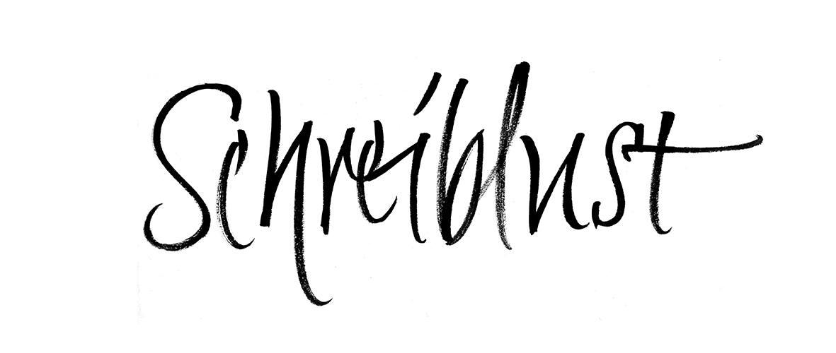
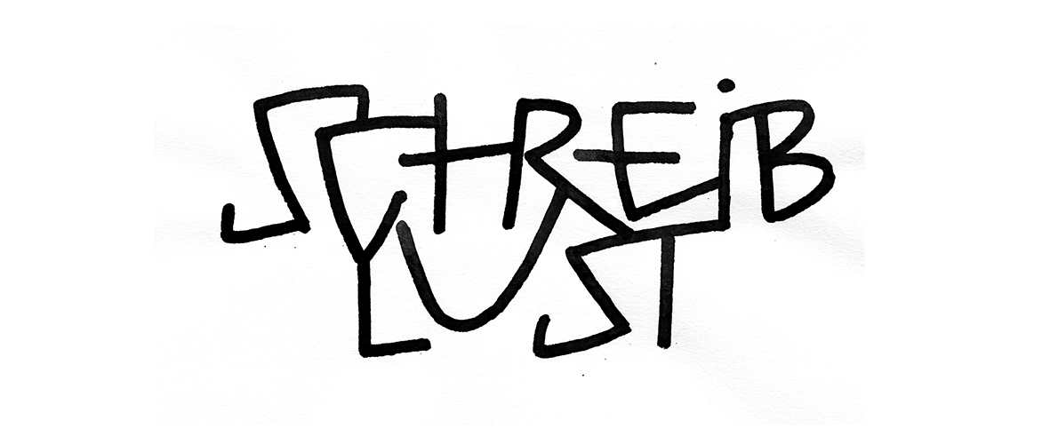
The tool always shapes the character of a script. Its traces should even be visible. Experiments? Yes please! Creating images out of letters is very exiting to do.
Pointed brush inspired by Humanistic Italic


